I haven't seen many pen tutorials around, so I thought I should add a tutorial of my own for it. I honestly am a beginner at this, as I learned this two days previous (June 30th), but this tutorial should be reliable :) This tutorial uses an image of Zell Dincht, from the game Final Fantasy VIII- a creation by Squaresoft. Specifically that because the mark on his cheek is perfect for this tutorial. There are no particularly defined "steps" in this tutorial. If there are any mistakes or questions ... or comments, please feel free to contact me. The table is smaller than the others because big wide spaces like it'd otherwise have annoy me oO;
This tutorial was also made in Adobe Photoshop 6.0, and should work for other full versions as well. I do not know about PSP.
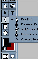 |
Select the pen tool. It should look like this, at least in Photoshop 6.0. For this particular tutorial, the foreground color will be black. The background color doesn't matter; it can be whatever color you choose. For this tutorial, we will be using specifically pen tool. Freeform is a bit more unaccurate, and the rest can be done with the pen tool.
The pen tool is absolutely the way that I made this vector. This tutorial will not teach you how to make something like this. Rather, it teaches you what makes it up. It is a stepping stone for you to start learning the pen tool. The basic shapes were made by the pen tool. (Actually, that's a horrible vector ... cause its mine XD) |
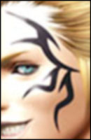 |
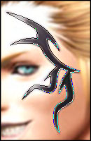
This is the image we will be working with. We will be tracing the black design on this character's cheek. It is slightly blurred because I had to make the image larger, and the low quality was irritating me- so I Gaussian Blurred it :D A larger image is always better to work with if you are using the pen tool. It gives you a clearer view, and more space. You will understand this once you see the jumble of the paths and corners, later into this tutorial. If you would like to follow this tutorial (which I would suggest, so you can better understand the pen tool), simply copy and paste this picture into a new canvas in your Photoshop version. |
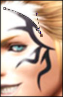 |
First, I made a point at the top of the shape. This is the square that is blank. Then, I made a second point, at the bottom of that crescent area. After making this point, I did not release my mouse clicker. I dragged it out towards the bottom of the image. As I did, "corners" drew out, and I stopped at the point that the path curved similarly to the arc that the shape makes. The other two points, one purple and one half purple, were the results.
However, if you are going along with the tutorial, you would notice that the "corners" are connected by a straight line. This was true of my own image. But with the pen tool, you are supposed to drag it in the direction that it will go into next. Sometimes with shapes, especially like this one, you cannot drag it that way. So what I did was hold alt (for Macs, it should be option) and dragged the bottom corner so that it led up the cresent again in that way (the corner is the shorter one). |
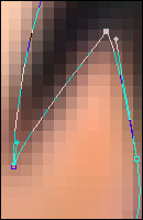 |
I continued with the path. At this particular point (you don't really need to know where, just pay attention to the points), you'll notice that the anchor point at the top has no corners coming from it. This is because I did not drag after clicking down. This makes it so that there is no curve- and is very useful when coming to an angle edge. This is a 1600% zoom in of one area of the canvas, to better show you the edges.
Something to also think about is the ctrl button. If you hold it and click on one of the corners, you can move that corner around - though this also moves around the other corner and the paths as well, so I tend not to use it. You can also hold the button down and click on the anchor point itself, and thus move it around. It can be very useful if you dont want to press ctrl+z a lot :)
|
 |
This is the full path, when it's closed. It can't be completely accurate, so don't be too hard on yourself if it is. The next step will start on the coloring, so it's suggested that you create a new layer (specifically labeled "scar" or "tatoo", or anything else that you know will signify it). This is especially important on vectors, if you want to save a tiny bit of time - it'll be easier than looking at the PSD icons to figure out what is on the layer. |
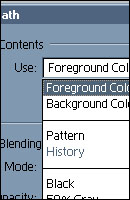 |
From there, right click (still on pen tool) on the canvas, and go to fill path. This will open up a dialogue box, which is similar to the one you see at right. It's a crop because I didn't want to minimize it :x Haha. Anyway, I always fill a path with the foreground color. But you don't have to fill it with the foreground color. You can fill it with the background color, a pattern, etc. When you have what you chose (I, foreground of course :P), click OK. That will fill the area selected by the path.
Just for show, I also outlined it. This is done by right clicking with the pen tool on the canvas, and going down to stroke path. But before you do this, youll want to set what you want to use (I will 99% of the time use the Paintbrush on 1px diameter and a hardness of 0) and note what tool it is. A dialogue box will open up when you click on stroke path, smaller than the one shown at right. Select the tool and click okay. For this, I reversed the colors so that the red was the foreground. Foreground color is the automatic color. (I also created a new layer for this stroke.) |
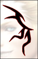 |
This is the result. The shape is completely black and with a red border. Below the filled in shape and above the base layer, I put a normal white layer at 75% opacity so you could better distinguish the shape. If you are still seeing the path, go to the Paths panel (if you do not have it, go to Window --> Show Paths) and deselect it- click on anywhere in the box other than the buttons and the layer. I usually will delete my paths (trash can button at the bottom right) after I'm finished with them, but you don't have to if you don't want to :P
Also if you'll notice, the original picture has some lighter parts on the shape. You can use the dropper tool to get a good color (though this often deems hard, at least for me) and start making paths around those areas. What to do when you want to add in these lighter areas is lock transparency for the shape layer and then you can loosely path it, with no worry of going out of the lines when you color it.
|